Design Guidelines
Selects
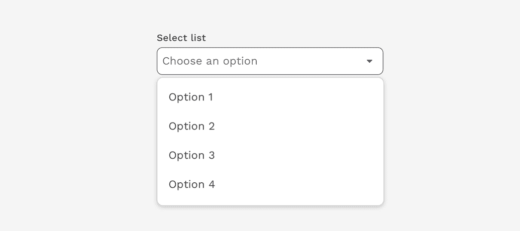
The Select component allows users to choose one or more options from a list. It is used in forms for users to submit data.
Select vs. Dropdown
While the Select and Dropdown components can look similar, they have different functions.
- Use the Select component inside a form where users are selecting from a list of options and submitting data.
- Use the Dropdown component to display menus and filter or sort content on a page.
Advanced Selects
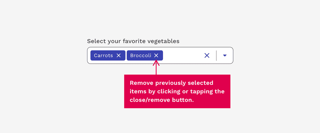
Multiselect
Multiselects are exactly what the name implies – A Select input that allows the user to choose multiple values to be submitted at the same time. Previously selected options may be removed with the associated close/remove button.
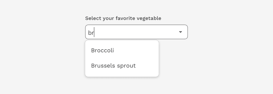
Combobox
A Combobox is similar to a Select component, in that it is used for collecting user provided information from a list of options. However, a combobox also allows users to type in the field, either to create their own option or to see typeahead suggestions. This can also be combined with the Multiselect functionality.
View component API for Combobox.