Design Guidelines
Typography
Cengage applications need clear and consistent headings, highly legible body paragraphs, and clear labels. Our typefaces are chosen for legibility and maximum support for mathematical characters.
By consistently tying typographic styles to appropriate functions in the interface, we create a clear visual pattern for students and faculty to follow while they’re interacting with our products.
Magma Type Sets
Magma has three sets of ready-made typographic elements that you can choose from and should be adhered to when at all possible. Each one combines a font family with calibrated sizes and weights to work within applications or editorial content. The three sets are called Productive, Expressive, and Narrative.
IMPORTANT: The Productive set is used by default in the components so you won't actually see it referred to in the code. You can easily change to Expressive or Narrative when appropriate by adding the necessary prop.
Productive Type Set (Default)
Productive type is reserved for use in web-based product design, where the user needs to focus on tasks. The Productive styles are curated to create a series of clear user expectations about hierarchy. The difference between the Productive and Expressive styles is mainly evident in the Headings.
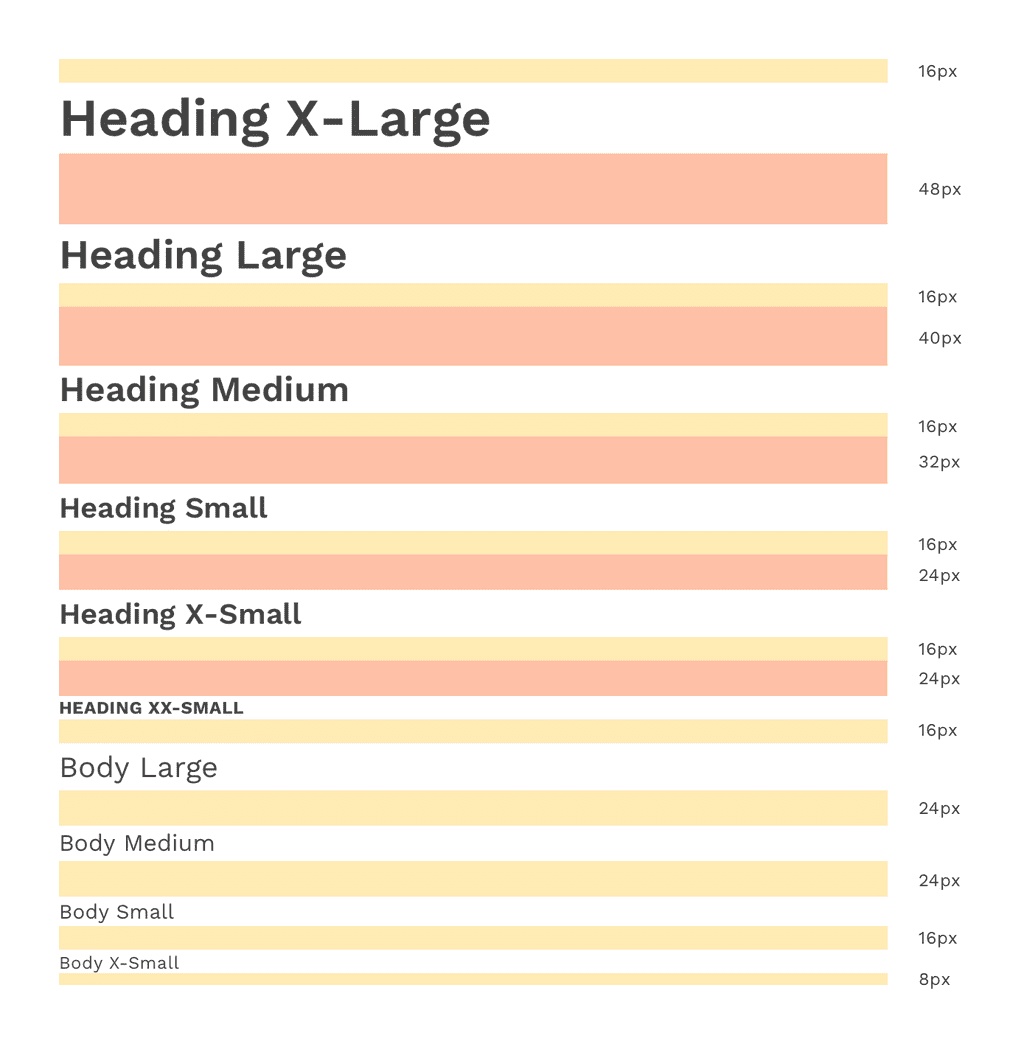
Productive Body Text Styles
This is a good size for higher emphasis text, as well as the subheadline of a page.
Body / Large
Typeface: Work Sans
Size: 20px / 1.25em
Line-height: 32px / 2em
Weight: Regular / 400
Letter-spacing: 0px
Body / Large
Typeface: Work Sans
Size: 18px / 1.125em
Line-height: 24px / 1.5em
Weight: Regular / 400
Letter-spacing: 0px
This is commonly used in layouts for paragraphs. The line height and size make for comfortable, long-form reading, in mediums that allow for more space. This size type is the basis for how all other text is calculated.
Body / Medium
Typeface: Work Sans
Size: 16px / 1em
Line-height: 24px / 1.5em
Weight: Regular / 400
Letter-spacing: 0px
This is commonly used for helper and error text on inputs, as well as other explanatory text.
Body / Small
Typeface: Work Sans
Size: 14px / .875em
Line-height: 20px / 1.25em
Weight: Regular / 400
Letter-spacing: .16px
This is good to use for captions and other meta-data or explanatory text.
Body / X-Small
Typeface: Work Sans
Size: 12px / .75em
Line-height: 16px / 1em
Weight: Regular / 400
Letter-spacing: .32px
Productive Heading Text Styles
This is used for layout headings
Heading / X-Large
Typeface: Work Sans
Size: 36px / 2.25em
Line-height: 48px / 3em
Weight: Semibold / 600
Letter-spacing: 0px
Heading / X-Large
Typeface: Work Sans
Size: 28px / 1.75em
Line-height: 40px / 2.5em
Weight: Semibold / 600
Letter-spacing: 0px
This is used for layout headings
Heading / Large
Typeface: Work Sans
Size: 28px / 1.75em
Line-height: 40px / 2.5em
Weight: Semibold / 600
Letter-spacing: 0px
Heading / Large
Typeface: Work Sans
Size: 24px / 1.5em
Line-height: 32px / 2em
Weight: Semibold / 600
Letter-spacing: 0px
This is used for layout headings and component titles
Heading / Medium
Typeface: Work Sans
Size: 24px / 1.5em
Line-height: 32px / 2em
Weight: Semibold / 600
Letter-spacing: 0px
Heading / Medium
Typeface: Work Sans
Size: 20px / 1.25em
Line-height: 32px / 2em
Weight: Semibold / 600
Letter-spacing: 0px
This is used for layout headings and component titles
Heading / Small
Typeface: Work Sans
Size: 20px / 1.25em
Line-height: 32px / 2em
Weight: Semibold / 600
Letter-spacing: 0px
Heading / Small
Typeface: Work Sans
Size: 18px / 1.125em
Line-height: 24px / 1.5em
Weight: Semibold / 600
Letter-spacing: 0px
This is used for layout headings and component titles
Heading / X-Small
Typeface: Work Sans
Size: 18px / 1.125em
Line-height: 24px / 1.5em
Weight: Semibold / 600
Letter-spacing: 0px
This is used for layout headings and component titles
Heading / 2X-Small
Typeface: Work Sans
Size: 12px / .75em
Line-height: 16px / 1em
Weight: Bold / 700
Letter-spacing: .32px
Expressive Type Set
Expressive type is reserved for use in editorial and digital marketing experiences which may require more dynamic typographic hierarchies and more variety in the Heading scale. The Expressive styles are curated to create a series of clear user expectations while still allowing for a more dramatic, graphic use of type.
Expressive Body Text Styles
This is a good size for higher emphasis text, as well as the subheadline of a page.
Body / Large
Typeface: Work Sans
Size: 24px / 1.5em
Line-height: 32px / 2em
Weight: Regular / 400
Letter-spacing: 0px
Color: primary600 / #292F7C
Body / Large
Typeface: Work Sans
Size: 20px / 1.25em
Line-height: 32px / 2em
Weight: Regular / 400
Letter-spacing: 0px
Color: primary600 / #292F7C
Expressive Heading Text Styles
This is used for layout headings
Heading / 2X-Large
Typeface: Work Sans
Size: 72px / 4.5em
Line-height: 84px / 5.25em
Weight: Semibold / 600
Letter-spacing: 0px
Heading / 2X-Large
Typeface: Work Sans
Size: 54px / 3.375em
Line-height: 64px / 4em
Weight: Semibold / 600
Letter-spacing: 0px
This is used for layout headings
Heading / X-Large
Typeface: Work Sans
Size: 52px / 3.25em
Line-height: 68px / 4.25em
Weight: Regular / 400
Letter-spacing: 0px
Heading / X-Large
Typeface: Work Sans
Size: 42px / 2.625em
Line-height: 48px / 3em
Weight: Regular / 400
Letter-spacing: 0px
This is used for layout headings
Heading / Large
Typeface: Work Sans
Size: 36px / 2.25em
Line-height: 48px / 3em
Weight: Light / 300
Letter-spacing: 0px
Heading / Large
Typeface: Work Sans
Size: 28px / 1.75em
Line-height: 40px / 2.5em
Weight: Light / 300
Letter-spacing: 0px
This is used for layout headings and component titles
Heading / Medium
Typeface: Work Sans
Size: 28px / 1.75em
Line-height: 40px / 2.5em
Weight: Light / 300
Letter-spacing: 0px
Heading / Medium
Typeface: Work Sans
Size: 24px / 1.5em
Line-height: 32px / 2em
Weight: Light / 300
Letter-spacing: 0px
This is used for layout headings and component titles
Heading / Small
Typeface: Work Sans
Size: 24px / 1.5em
Line-height: 32px / 2em
Weight: Light / 300
Letter-spacing: 0px
Heading / Small
Typeface: Work Sans
Size: 20px / 1.5em
Line-height: 32px / 2em
Weight: Light / 300
Letter-spacing: 0px
This is used for layout headings and component titles
Heading / X-Small
Typeface: Work Sans
Size: 20px / 1.25em
Line-height: 32px / 2em
Weight: Light / 300
Letter-spacing: 0px
Heading / X-Small
Typeface: Work Sans
Size: 18px / 1.25em
Line-height: 24px / 1.5em
Weight: Light / 300
Letter-spacing: 0px
This is used for layout headings and component titles
Heading / 2X-Small
Typeface: Work Sans
Size: 16px / 1em
Line-height: 24px / 1.5em
Weight: Bold / 700
Letter-spacing: .32px
Narrative Type Set
Narrative type uses Noto Serif but is otherwise styled the same as the default Productive variant. The Narrative styles are curated to create a series of clear user expectations about hierarchy, but in a font that is more pleasurable for reading long passages of text.
Narrative Body Text Styles
This is a good size for higher emphasis text, as well as the subheadline of a page.
Body / Large
Typeface: Noto Serif
Size: 20px / 1.25em
Line-height: 32px / 2em
Weight: Regular / 400
Letter-spacing: 0px
Body / Large
Typeface: Noto Serif
Size: 18px / 1.125em
Line-height: 24px / 1.5em
Weight: Regular / 400
Letter-spacing: 0px
This is commonly used in layouts for paragraphs. The line height and size make for comfortable, long-form reading, in mediums that allow for more space. This size type is the basis for how all other text is calculated.
Body / Medium
Typeface: Noto Serif
Size: 16px / 1em
Line-height: 24px / 1.5em
Weight: Regular / 400
Letter-spacing: 0px
This size is great for creating contrast between the main paragraph of the passage and secondary information.
Body / Small
Typeface: Noto Serif
Size: 14px / .875em
Line-height: 20px / 1.25em
Weight: Regular / 400
Letter-spacing: .16px
This is good to use for captions and other meta-data or explanatory text.
Body / X-Small
Typeface: Noto Serif
Size: 12px / .75em
Line-height: 16px / 1em
Weight: Regular / 400
Letter-spacing: .32px
Narrative Heading Text Styles
This is commonly used for H1 headings
Heading / X-Large
Typeface: Noto Serif
Size: 36px / 2.25em
Line-height: 48px / 3em
Weight: Bold / 700
Letter-spacing: 0px
Heading / X-Large
Typeface: Noto Serif
Size: 28px / 1.75em
Line-height: 40px / 2.5em
Weight: Bold / 700
Letter-spacing: 0px
This is commonly used for H2 headings
Heading / Large
Typeface: Noto Serif
Size: 28px / 1.75em
Line-height: 40px / 2.5em
Weight: Bold / 700
Letter-spacing: 0px
Heading / Large
Typeface: Noto Serif
Size: 24px / 1.5em
Line-height: 32px / 2em
Weight: Bold / 700
Letter-spacing: 0px
This is commonly used for H3 headings
Heading / Medium
Typeface: Noto Serif
Size: 24px / 1.5em
Line-height: 32px / 2em
Weight: Bold / 700
Letter-spacing: 0px
Heading / Medium
Typeface: Noto Serif
Size: 20px / 1.25em
Line-height: 32px / 2em
Weight: Bold / 700
Letter-spacing: 0px
This is commonly used for H4 headings
Heading / Small
Typeface: Noto Serif
Size: 20px / 1.25em
Line-height: 32px / 2em
Weight: Bold / 700
Letter-spacing: 0px
Heading / Small
Typeface: Noto Serif
Size: 18px / 1.125em
Line-height: 24px / 1.5em
Weight: Bold / 700
Letter-spacing: 0px
This is commonly used for H5 headings
Heading / X-Small
Typeface: Noto Serif
Size: 18px / 1.125em
Line-height: 24px / 1.5em
Weight: Bold / 700
Letter-spacing: 0px
This is commonly used for H6 headings
Heading / 2X-Small
Typeface: Noto Serif
Size: 12px / .75em
Line-height: 16px / 1em
Weight: Bold / 700
Letter-spacing: .32px
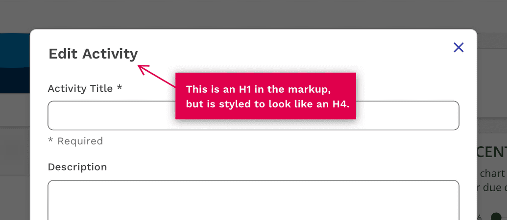
Changing Headings Styles
The headings presets above are assigned by default to H1 through H6 in the Headings component. But it's relatively common to need a specific heading type in the markup, but not want the default styling. For this reason we have made it very easy to change which styling preset you use in the headings component.
One example of this is in the Modal component. For optimal accessibility the title of the modal needs to be an H1, but we definitely don't want it to be styled with text that large. So we use an H1, but apply the Productive Heading Small style to it. This flexibility allows consumers of Magma to design using the styles that work best for the UI, but still have a clear informational hierarchy for assistive technologies.
Consistency is Key
Continuing from above, there isn't just one way an H1 or and H3 should be styled. We have chosen logical default styles, but it's easy to say you need an H3 to be styled using one of the larger or smaller presets. The key is to be consistent. If you style a page title using productive-heading-large, then you need to use the same styling on all of the pages. If you use "productive-heading-xsmall" to style the title of a section, then you should use the same styling on equivalent sections.
Responsive Behavior
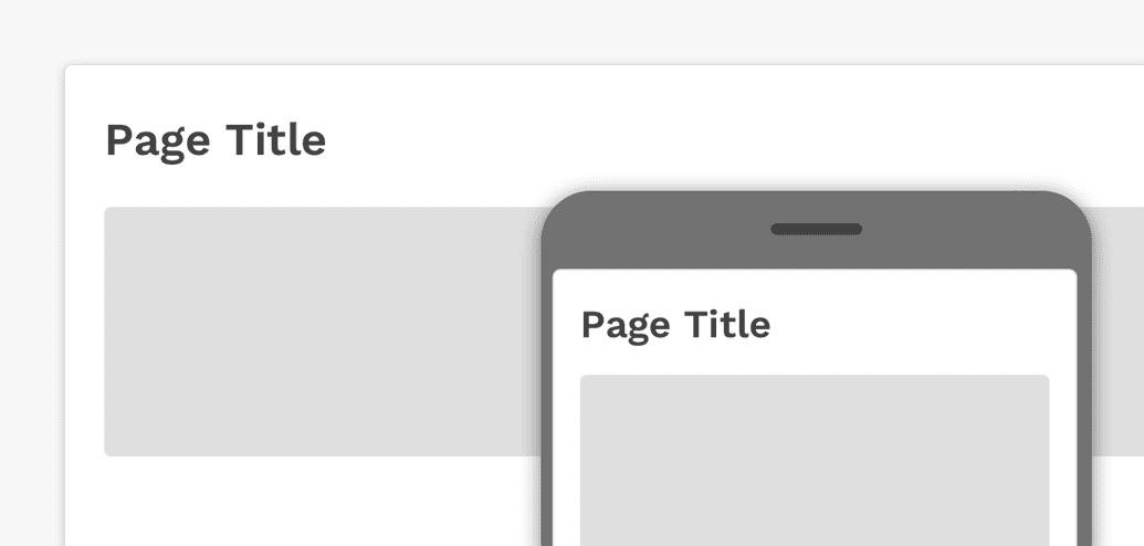
Another advantage to using the presets above is that Responsive behavior is already built into each style so you don't have to figure out and include it yourself. This means a number of the larger sizes will automatically reduce in size at 600px wide. This ensures we have appropriate text sizes on smaller devices. The breakpoint can be overridden if you want this change to happen earlier or later.
Typefaces
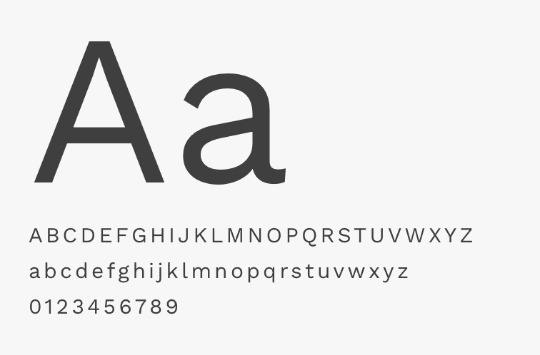
Work Sans
Our primary typface is Work Sans. It’s clear and approachable and is great for headlines, subheads, navigation and body copy.
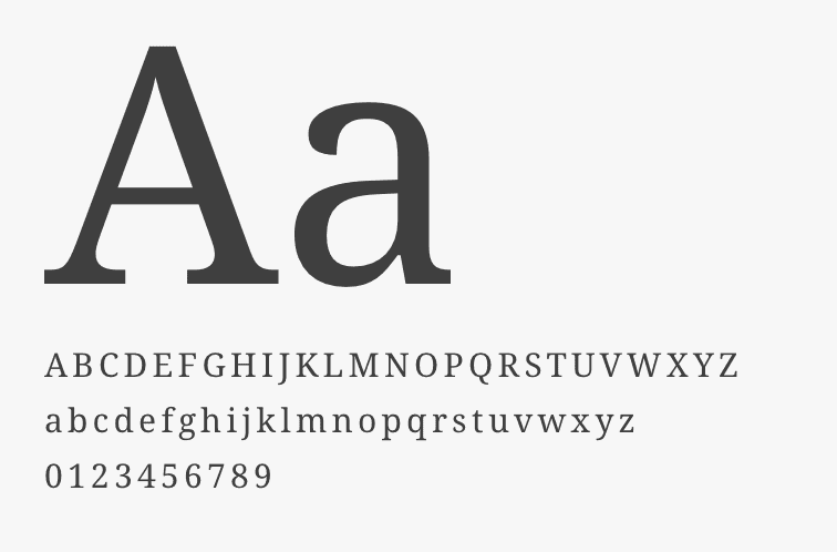
Noto Serif
Noto Serif is a beautiful serif font. It's easy to read, provides a nice contrast with Work Sans and has great support for special characters. At this point, Noto Serif should primarily be used for the reader applications that display our text books.
When text is rendered by a computer, sometimes there will be characters in the text that can not be displayed, because no font that supports them is available to the computer. When this occurs, small boxes are shown to represent the characters. We call those small boxes “tofu,” and we want to remove tofu from the Web. This is how the Noto font families got their name.
Noto helps to make the web more beautiful across platforms for all languages. Currently, Noto covers over 30 scripts, and will cover all of Unicode in the future. This is the Serif Latin, Greek and Cyrillic family. It has Regular, Bold, Italic and Bold Italic styles and is hinted.
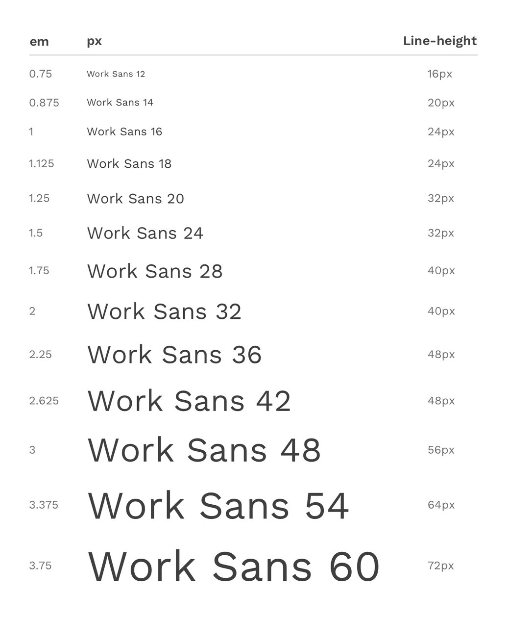
Type Scale
The font sizes used in the sets above come from the full type scale. This type scale is based on the Major Second Type Scale (1.125) but is slightly modified to round to whole numbers and create a simple pattern in the difference between each size. Small font sizes differ by 2px, and then that difference increases by 4px and then 6px as the size gets larger.
Line-heights are also defined at this level to adhere to an 8px spacing system, and should not be changed unless absolutely necessary
If you have a need to use a font size outside of the pre-made sets above, you may only choose from this list.
Styles
Weight
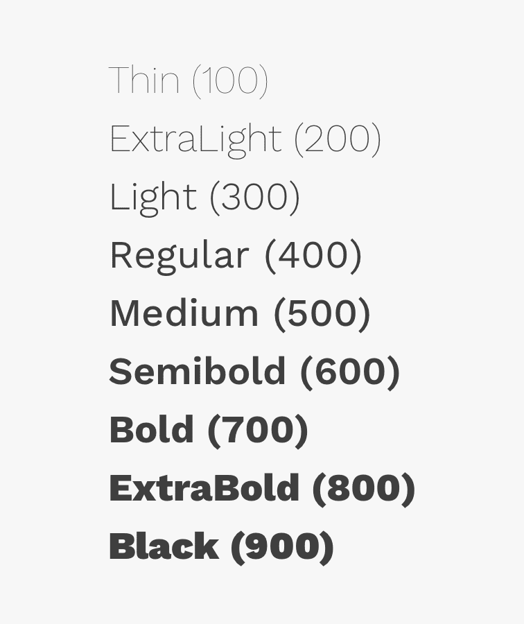
Font weight is an important typographic variable that can add emphasis and differentiate content hierarchy. Font weight and size pairings must be carefully balanced. A bold weight will always have more emphasis than a lighter weight font of the same size. However, a lighter weight font can rank hierarchically higher than a bold font if the lighter weight type size is significantly larger than the bold one. The weights available in React Magma are thin (100), extra-light (200), light (300), regular (400), medium (500), semi-bold (600), bold (700), extra-bold (800) and black (900).
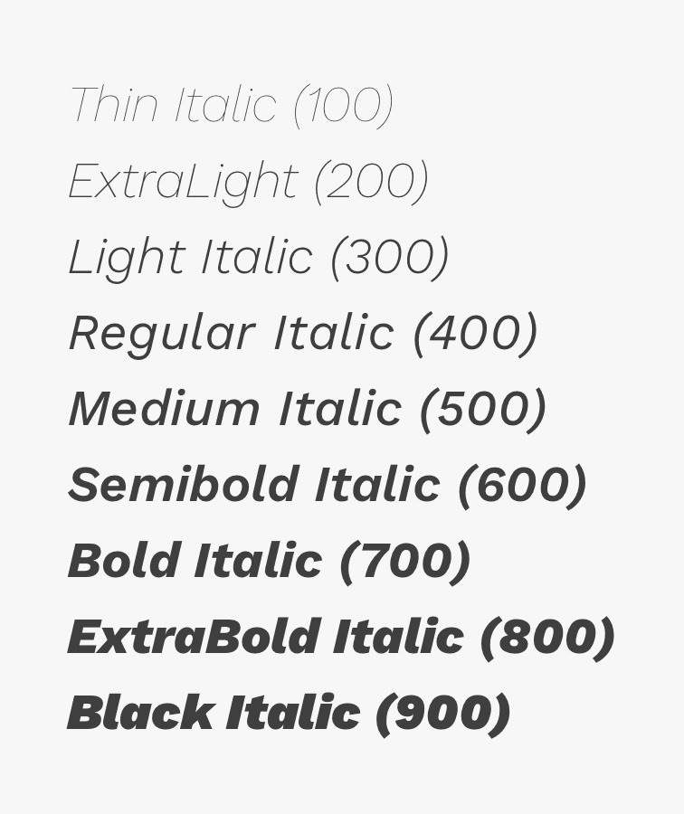
Italic
Each weight has an italic style, which should only be used when you need to emphasize certain words in a sentence (titles of works, technical terms, names of devices, captions, etc.).
Color
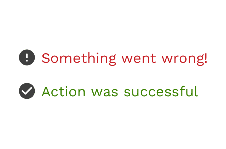
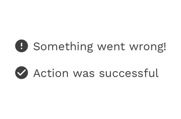
Type color should be carefully considered, with legibility and accessibility as your main concerns. Color can be helpful for reinforcing the meaning or context of a piece of text or action, but color should never be the only way this is communicated, or just for decoration. When text is generally kept neutral in color, then it can be much more powerful when you do need to use it to point out actions or a special important messages. The text itself is the clearest way to explain what the user needs to know, but icons can also help provide helpful clues.
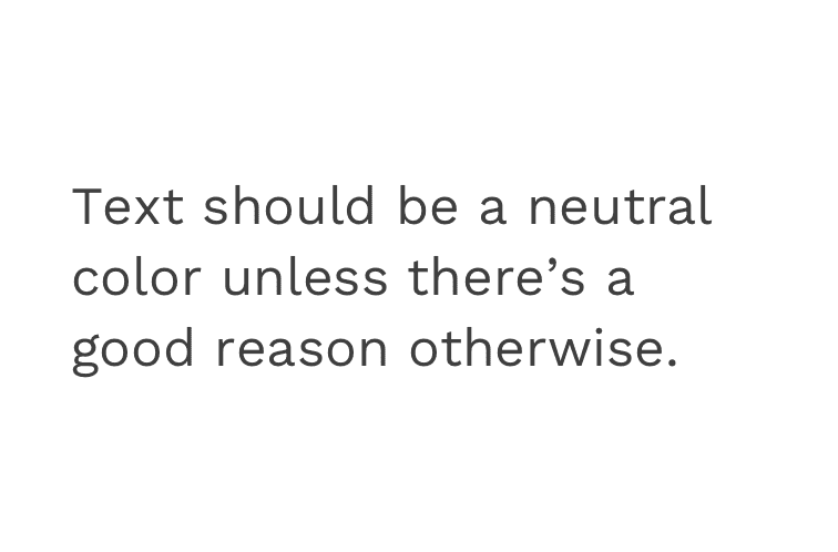
Correct
Text should generally be kept neutral in color until there's a reason to use a color.
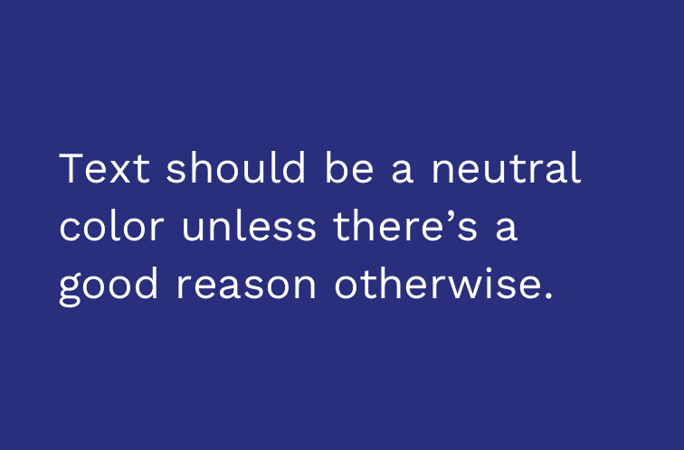
Correct
On dark backgrounds, neutral text appears as white.
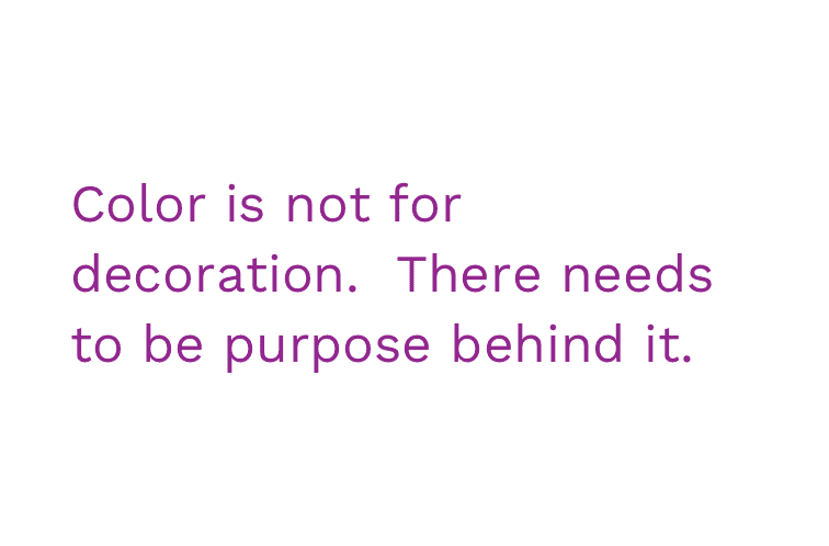
Incorrect
Don't use color as decoration.
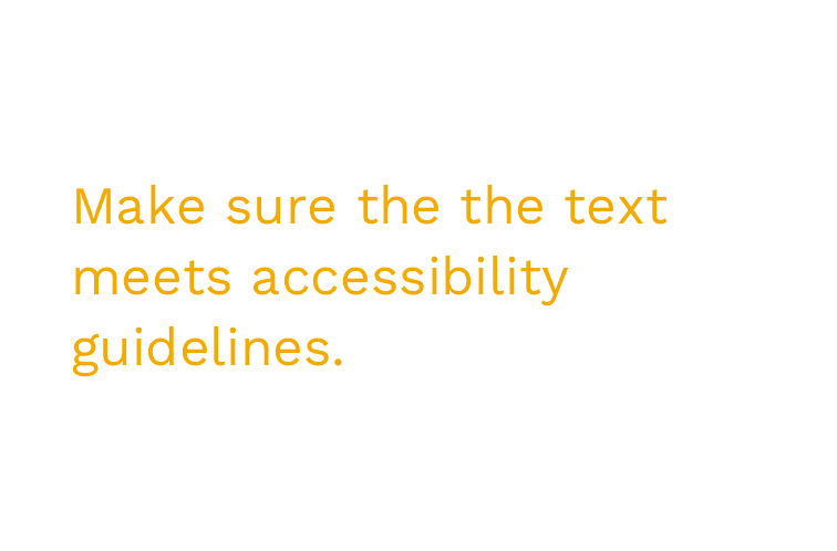
Incorrect
The contrast between text and its background needs to be 4.5:1, or 3:1 for large (18px) text.
Correct
Appropriate color usage can help reinforce the meaning of text, but is not a replacement for clear text and other helpful visual aids like icons.
Correct
A message is successful if you can remove the color from it, and the meaning is still clear.
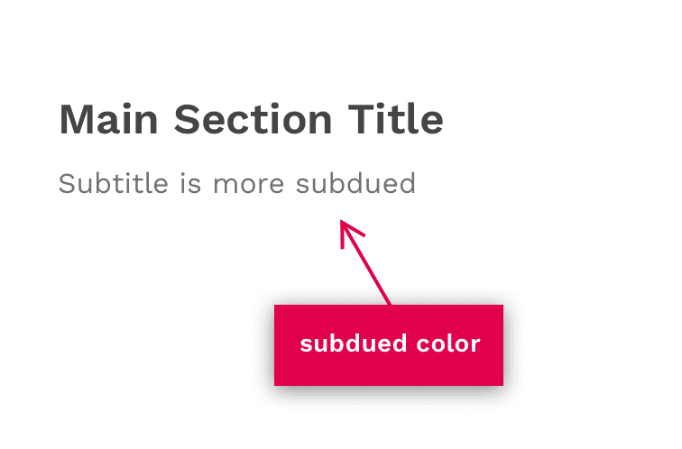
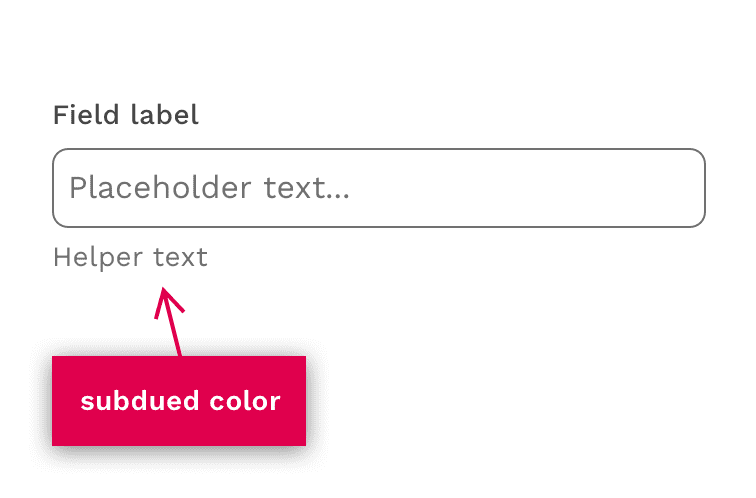
Subdued
It is common to lighten certain pieces of text in order to create more contrast. For example, making a subtitle more subdued than the title, or instructional text like the helper text on form inputs. This can be easily done by applying the "subdued" color to a piece of text. On a light background, this makes the color #707070. The inverse equivalent is a semi-transparent white.
Margins
Headings and paragraphs have margins built into them by default. These margins provide the desired rhythm created by spacing when they are used together in a traditional narrative context. These margins can be easily modified using the spacing scale or completely removed when using headings or paragraphs in other contexts.