Design Guidelines
Selection Control
Selection controls allow the user to select options.
Usage
Selection controls allow users to complete tasks that involve making choices such as selecting options, or switching settings on or off. Selection controls are found on screens that ask users to make decisions or declare preferences such as settings or dialogs.
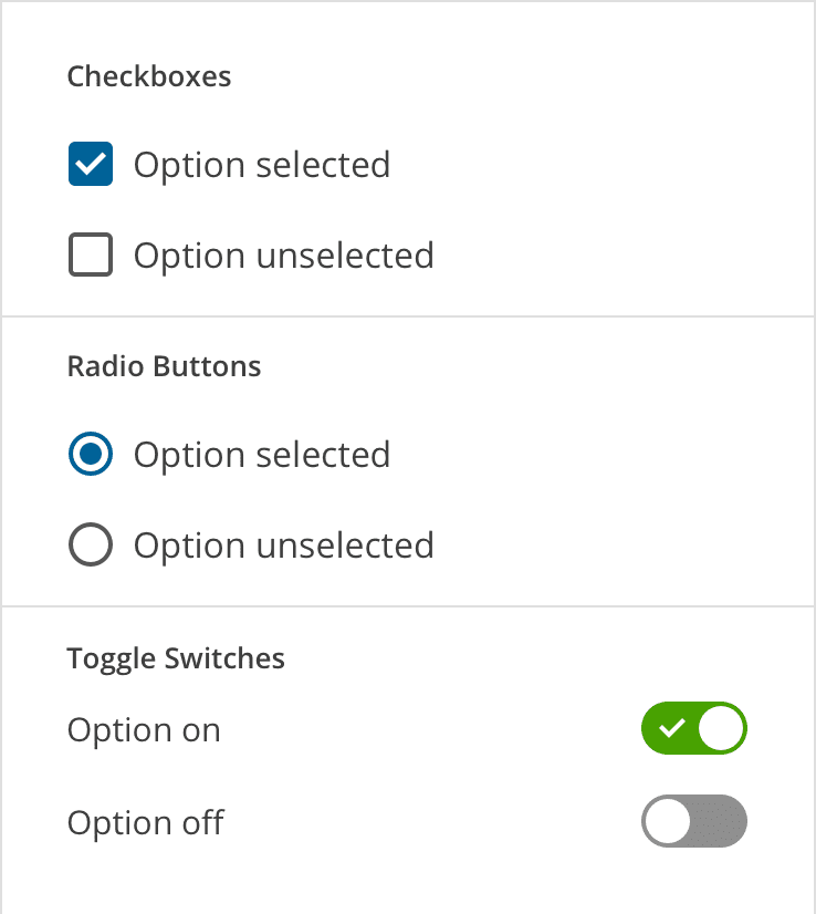
Selection controls
Principles
Familiar
Selection controls have been in user interfaces for a long time and should be used as expected.
Scannable
It should be visible at a glance if a selection control has been selected, and selected items should be more visually prominent than unselected items.
Efficient
Selection controls make it easy to compare available options.
Checkboxes
When to Use Checkboxes
Use checkboxes to:
- Select one or multiple items from a list
- Present a list containing sub-selections
- Turn an option/setting on or off
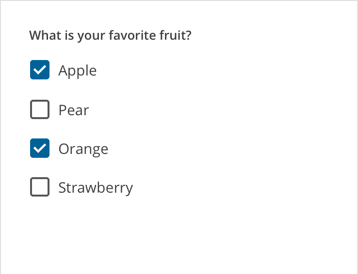
Checkboxes
Parent and Child Checkboxes
Checkboxes can have a parent-child relationship with other checkboxes.
- When the parent checkbox is checked, all child checkboxes are checked
- If a parent checkbox is unchecked, all child checkboxes are unchecked
- If some, but not all, child checkboxes are checked, the parent checkbox becomes an indeterminate checkbox
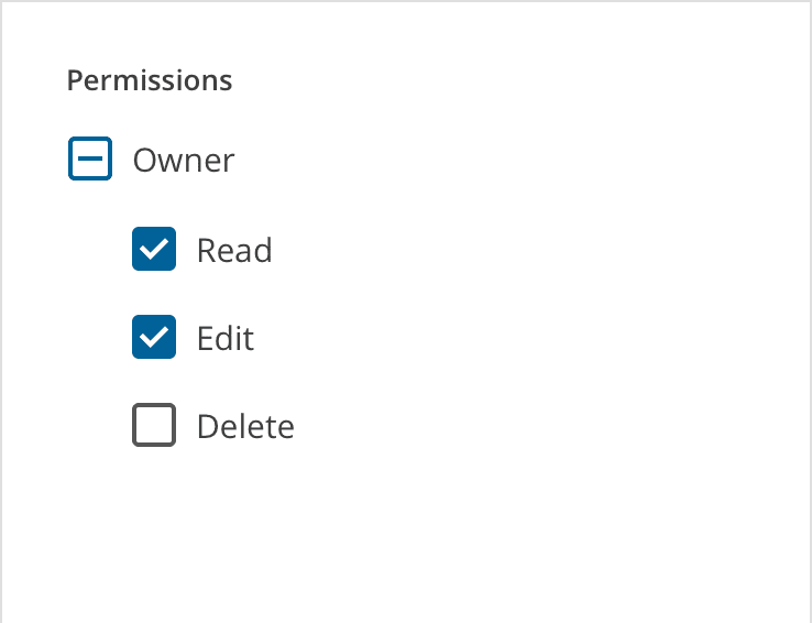
Parent-child relationship for checkboxes
States
Checkboxes can be selected, unselected, or indeterminate. Checkboxes have enabled, disabled, focused and pressed states.
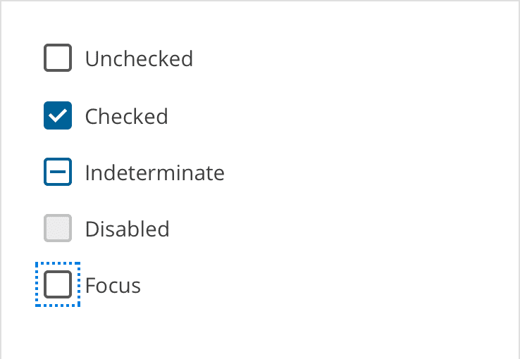
Checkbox states
Colors
The default color used for checked checkboxes is the "primary" color in the Magma palette, but sometimes a special scenario or specific UI can benefit from using one of the other colors from the palette. Colors like Success Green, Danger Red, or just one of the "Pop" colors, when used responsibly and consistently, can help add context to your checkbox or just add some visual interest.
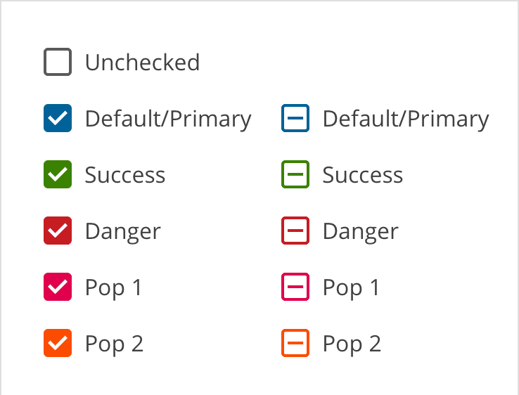
Alternate colors
Inverse Checkboxes
Sometimes you have to put those checkboxes on a dark background, and that's when you'll want to use the inverse version. You can also still use alternate colors like Success Green and Danger Red if you wish.
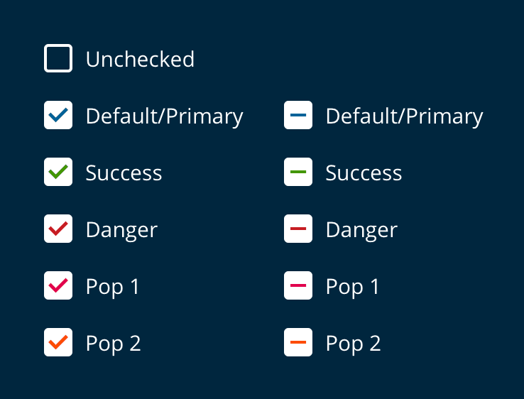
Inverse colors
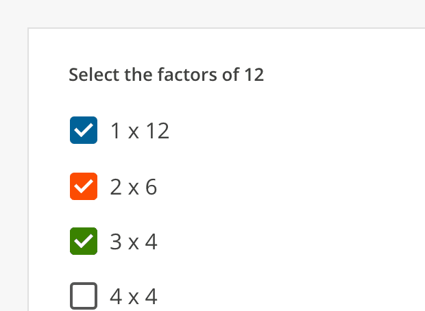
Incorrect
Don't use multiple colors in the same UI. Pick one and stick with it.
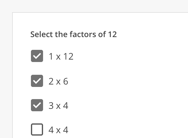
Incorrect
If you're going to change the color, don't use a neutral color. This could be confused with a checkbox that is checked and disabled.
Radio Buttons
When to Use Radio Buttons
Use radio buttons to select a single option from a list. Radio buttons should be used instead of checkboxes if only one item can be selected from a list.
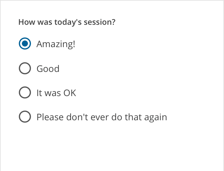
Radio buttons
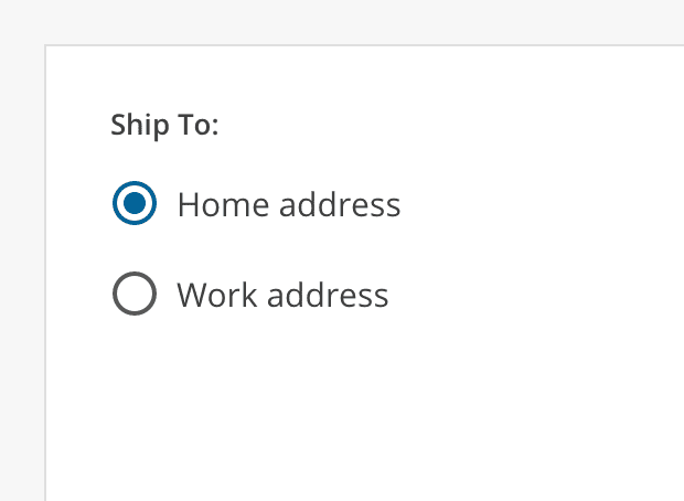
Correct
Use radio buttons when only one item can be selected from a list.
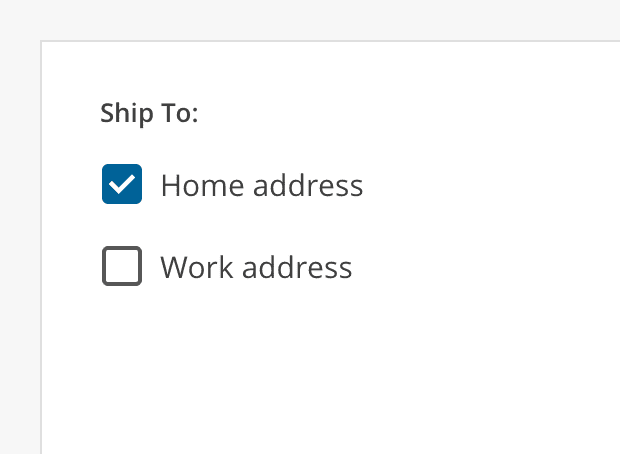
Incorrect
Don’t use checkboxes when only one item can be selected from a list. Use radio buttons instead.
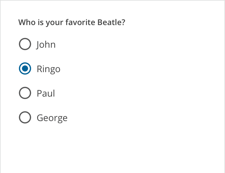
Radio buttons - only one option can be selected at a time.
States
Radio buttons can be off or on. Radio buttons have enabled, focused and pressed states.

Radio states
Colors
The default color used for radio buttons is the "primary" color in the Magma palette, but sometimes a special scenario or specific UI can benefit from using one of the other colors from the palette. Colors like Success Green, Danger Red, or just one of the "Pop" colors, when used responsibly and consistently, can help add context to your radio button or just add some visual interest.
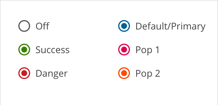
Alternate colors
Inverse Radio Buttons
Sometimes you have to put those radio buttons on a dark background, and that's when you'll want to use the inverse version. You can also still use alternate colors like Success Green and Danger Red if you wish.
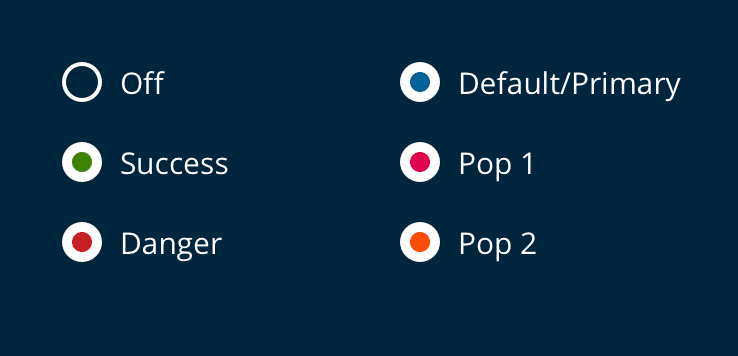
Inverse colors
Toggle Switches
When to Use Toggle Switches
Use toggle switches to toggle the state of a single setting on or off. You may use toggle switches within a web application, but keep in mind that they are most common within mobile applications.
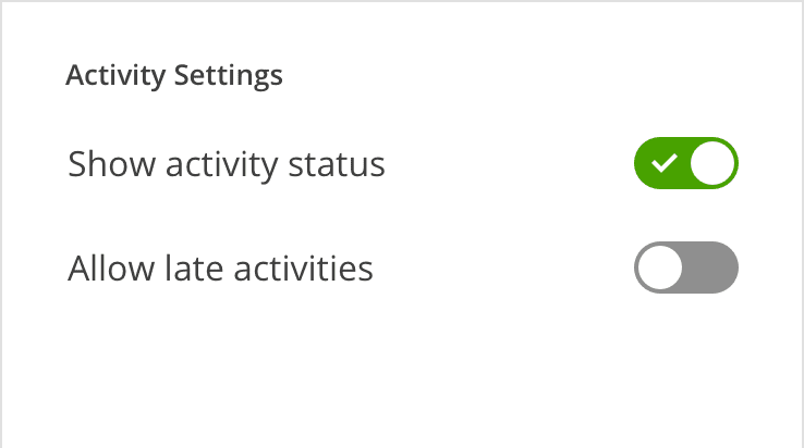
Toggle switches
States
The state of a toggle switch is changed by tapping or clicking on it, and the handle slides over to the other side of the track.
Text Label
The setting that the switch controls is made clear by the inline text label.
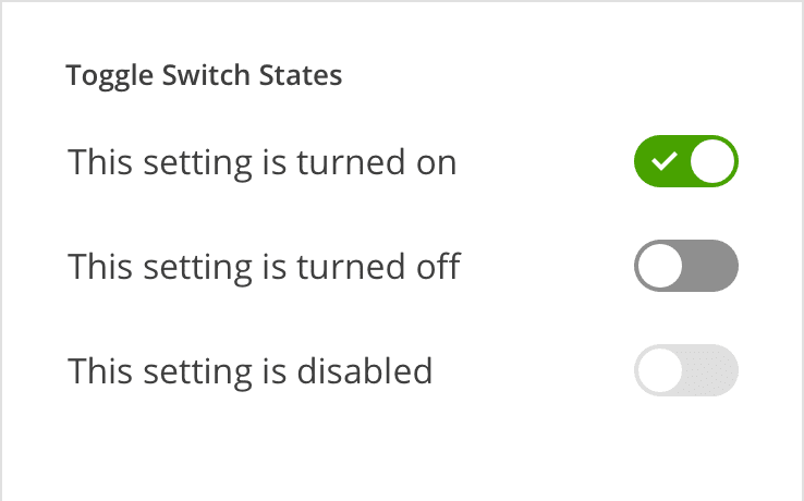
Toggle switch states