Design Guidelines
Progress Bar
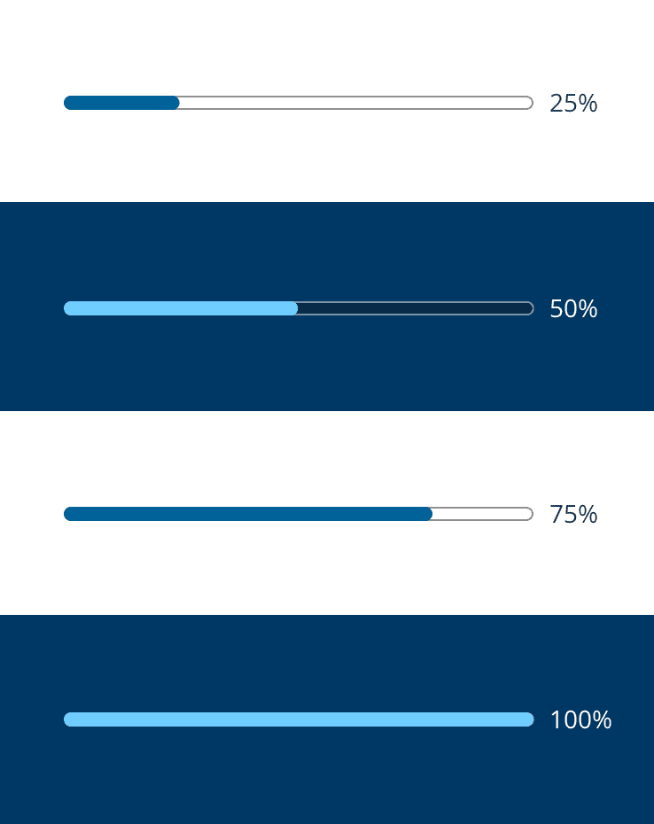
Progress bars communicate the percentage of a whole, which can be used in multiple contexts.
Usage
Progress bars can be used in different ways depending on where they are used or what data they are communicating to the user. This could be to communicate the status of a dynamic process like loading a page, or isolated to a discrete point in time like what step you are on in a multi-step process.
Perhaps most importantly, the progress bar should reflect real data or progress, and not be faked in order to just give the impression of progress.
To see how progress bars are used as loading indicators, view the loading indicator component.
Anatomy
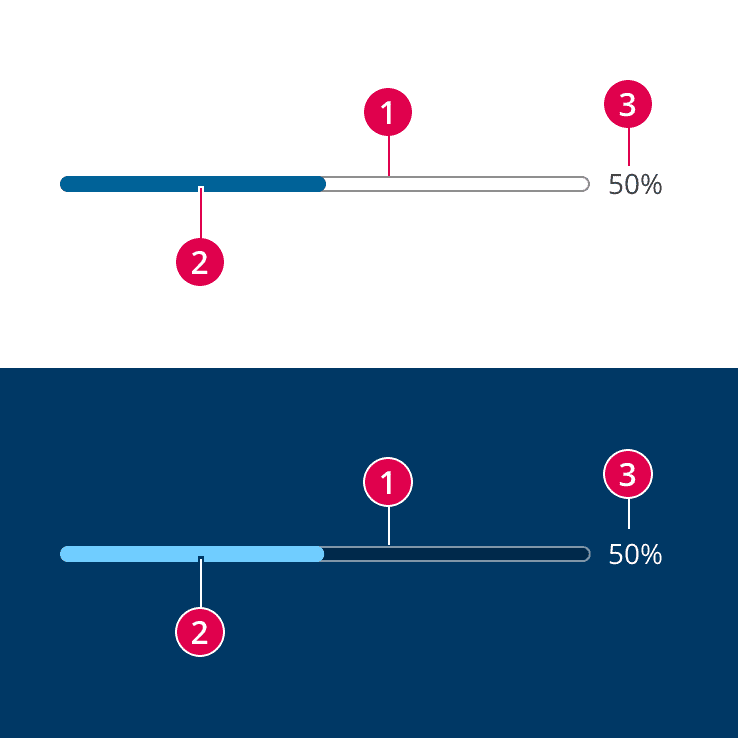
- Track - The track provides the boundaries for the indicator to travel along and represents 100% when filled.
- Indicator - The indicator fills up the track to a specified percentage provided to the component.
- Value label (optional) - This label presents the specific value being represented by the progress bar, and should be used when the precise value is what's most important to what the user needs to know.
Size
The default height of the progress bar is 8px. Technically the height of the progress bar can be changed to any value, but officially we only want to use the default height. If absolutely necessary, heights of 4px or 16px will also be considered.
The width of the progress bar is controlled by the container it is within. For maximum responsive behavior, you should avoid setting a specific width on the progress bar, and you should instead manipulate the container.
Behavior
Static
When a static progress bar is used, it represents the progress of something at that point in time and does not change until an explicit action is performed that updates the progress bar.
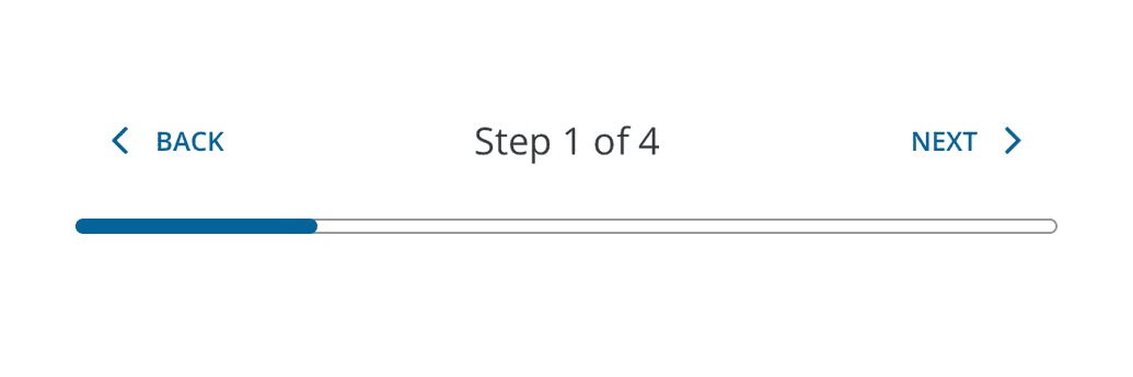
Example of using progress bar to help communicate that the user is on step one out of four.
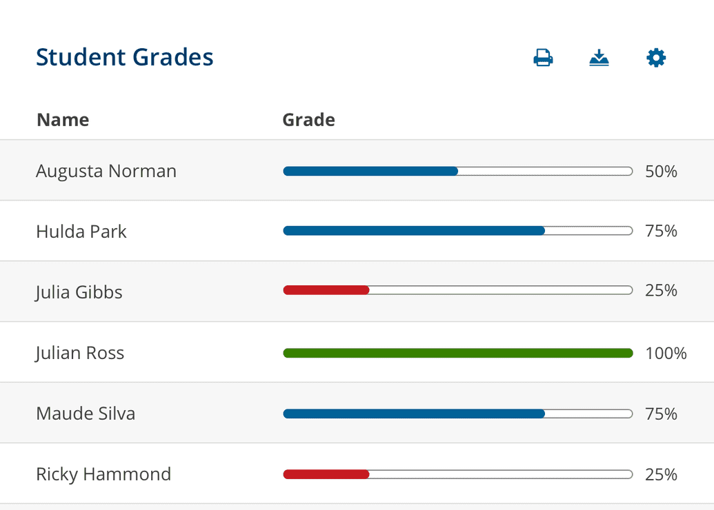
Progress bars can be used to visually display the same data point for multiple students, perhaps providing a quicker way to identify low performance.
Dynamic
When a dynamic progress bar is used, it means it's updating in real-time while you wait for a series of processes outside of your control to complete.
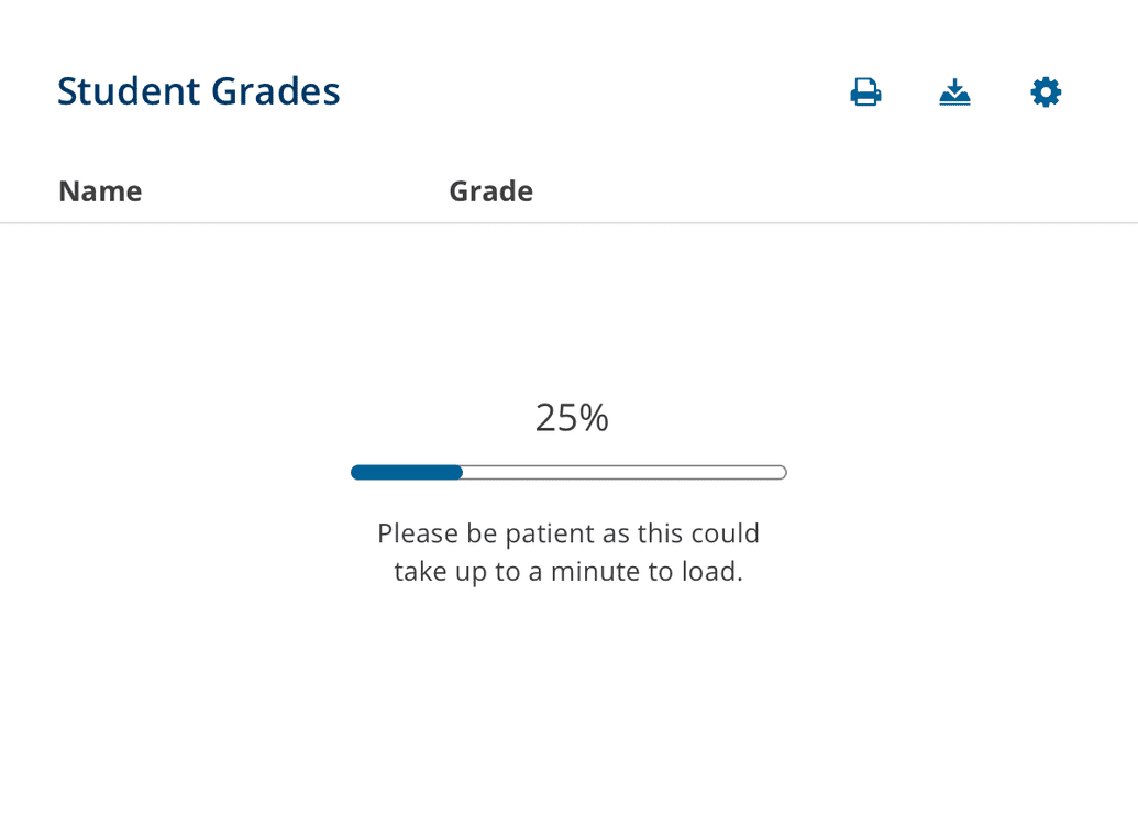
Example of using progress bar to help communicate that the data is loading and to expect a wait.
Colors
How we use color within the progress bar component is extremely important for meeting accessibility requirements (WCAG 2.1).
Track
The default track has a white background and the border is #8F8F8F. This gray was specifically added to the palette as the lightest gray possible to meet the 3:1 contrast ratio required for accessibility (WCAG 2.1). It is especially useful for borders like this.
The track on the dark/inverse progress bar has a black background at 25% opacity, and a white border at 50% opacity. This ensures the necessary contrast between the track and the background color it is put on, as well as the contrast between the track and the indicator inside it.
Note: The colors of the track should not be customized unless you are designing a new theme, and then it's your responsibility to make sure the new design meets accessibility requirements.
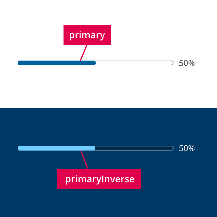
Indicator
The indicator's color by default is primary and the inverse default color is primaryInverse. It's important to make sure the contrast ratio between the indicator and the background of the track is at least 3:1. In addition to the default color, we are only officially supporting danger and success, both of which also have inverse colors in the palette.
